
Burnley’s minimalist crest had its days numbered. A trend adopted by sports in recent times that moved away from the traditions and history of its clubs.

For years, the English club wore a simple design, almost without embellishments, which many fans considered cold and soulless. Now everything has changed: the club unveiled a new crest full of details.
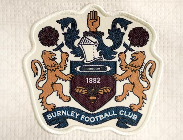
Symbols and nods to its century-old history are present in its new crest, appealing to the identity of its supporters, much more than a commercial silhouette.
The news has already generated mixed reactions. Defenders of minimalism regret the loss of that clean aesthetic, while others celebrate that the club has returned to its roots. Which side are you on?