
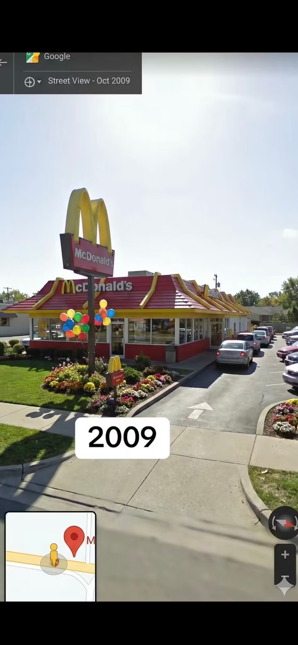
These are photographs of the same place taken 16 years apart, but they could easily look like two completely different restaurants.
A Google Street View comparison shows what a McDonald’s looked like in 2009: a red roof, huge yellow arches, flowers, grass, and even balloons in different colors.
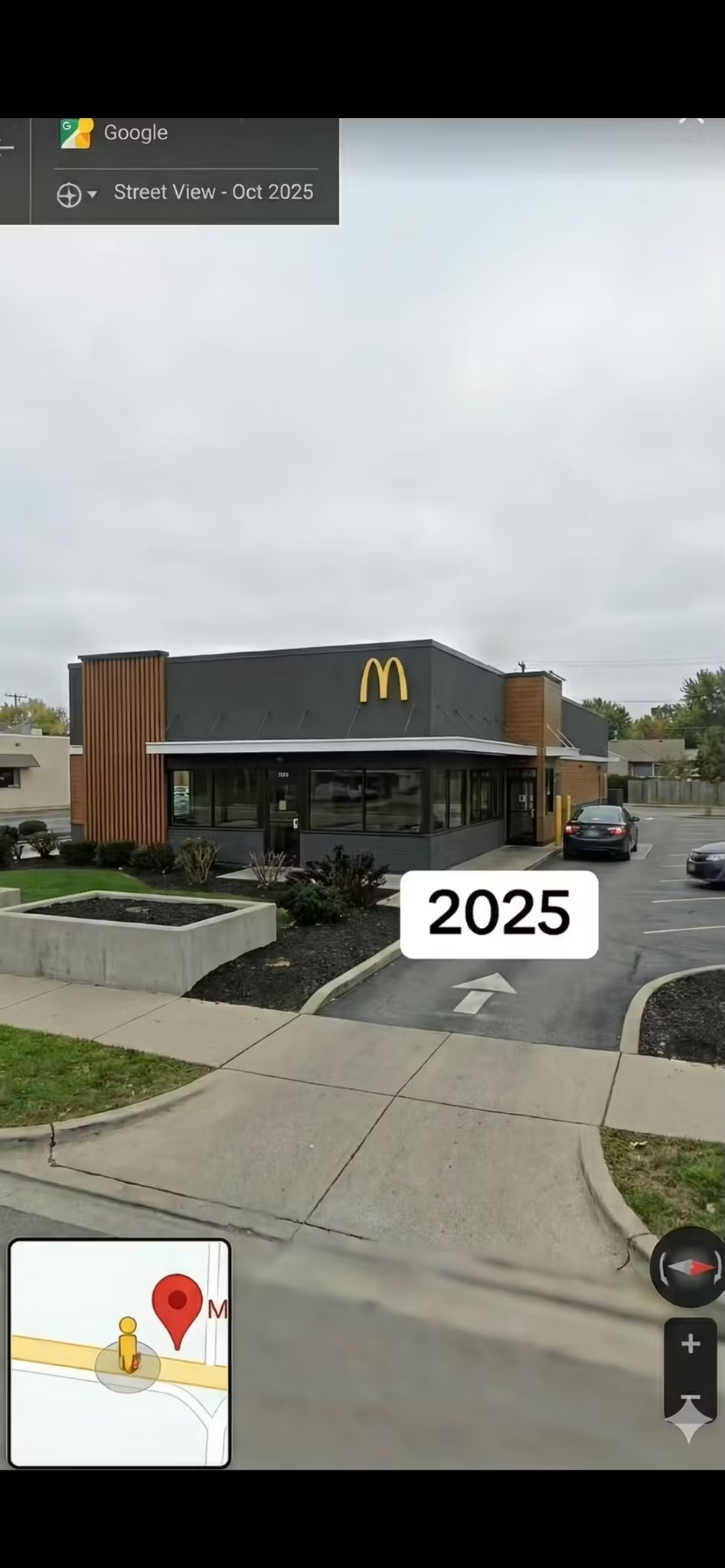
In the 2025 image, practically all of that has disappeared.
The building now has straight lines, gray and black walls, wood, and a small golden arch as its main splash of color.
“I want someone to explain to me why the colors disappeared”, wrote one user while sharing the comparison, which surpassed 16 million views.
But the transformation didn’t happen overnight.
Starting in the mid-2000s, McDonald’s began gradually moving away from the primary-color aesthetic that had characterized its restaurants. The company introduced wood, brick, earth tones, and more comfortable spaces in an effort to create an experience more like that of a café.
Years later, its new concepts took the change further with minimalist facades, glass, concrete, wood, and neutral colors, while restaurants added digital kiosks and mobile ordering.
The comparison ended up sparking a debate that goes far beyond hamburgers.
For some, the new design looks more elegant and modern. For others, it’s another example of how restaurants, brands, and everyday spaces have traded their colors for a gray, minimalist aesthetic.
And looking at both photographs side by side, the difference is hard to ignore:
McDonald’s still has its golden arches, but the colorful restaurant many people remember is becoming harder and harder to find.